720p, 29.97fps, 41 minutes and 45 seconds, two channel video installation, projected on a 107″ x 432″ roll of Super White Set paper.
One of the artworks in Paul Clay’s solo show entitled “Sketches and Memories, (synthesized compositions rendered later, upon the artists’ safe return home)”, Part of the Hudson Vally Center for Contemporary Art’s Peekskill Project V, at ArtWestchester’s The Arts Exchange Building, White Plains, NY, 2013.
Through and invitation from Livia Straus, President of HVCCA, and organized by curator Kianga Ellis.
Painters of the Hudson River School traveled to rather remote natural locations where they made sketches, studies and gathered visual memories, but then trekked back to the safety of their homes (and studios) to make the paintings, often combining elements from a variety of different locales into a single synthesized composition. My title for the exhibit is an oblique reference to this practice.
“Sketches and Memories…” is a collection of works addressing the history of Peekskill and White Plains New York, as well as that of the entire Hudson River Valley. The works combine the subjective and personal with larger forces, tracing geology, prehistory, international politics, and global cultural diffusion to tell the story of the region.
Installation Photo:
Video Excerpt (4 minutes, 30 seconds):
Project Description:
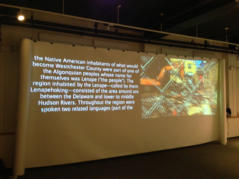
The video artwork “White Plains Story” incorporates subjective bits of White Plains history from interviews and personal experiences, and also looks at the connection between White Plains and New York City, told in the form of a cartoon, collage or animated comic book, and a long scrolling text. The two channels are projected onto a 9 foot high by 36 foot wide roll of white paper, scrolled up at both left and right ends to create a 22 foot screen.
One video channel projects scrolling text, like one might see at the end of a feature film, but instead of credits, the text tells the history of the White Plains area. It involves three sections or chapters. The first covers the history and language of the Native American Lenape who lived in the region for thousands of years, and the Wappinger confederacy who interacted with European arrivals mostly from the 1600 to 1800’s, along with the Weckquaesgeek, band who lived in what was to become White Plains. The second section covers the history of the Arts Exchange Building, where ArtsWestchester is based, and the third, the history of what European settlers referred to as “the white plains”, from the first non-native settlement in 1683 right up to the present.
A second video channel also projects three sections. The artists trip from New York City up to White Plains, a sit down interview with Kathleen Reckling, Gallery Director of ArtsWestchester about her work and her life growing up in the area, and a driving tour with local resident David Licata through various neighborhoods of the city. This second channel is in the form of a cartoon, shot entirely on an iPhone with the ToonCamera app, to convert the video into the visual look of cartoons, and then edited and enhanced in Final Cut Pro.
Both channels are projected onto a 107 inch by 36 foot long roll of Super White Set or photo background paper, evoking the notion of pages in books, and comic books in particular, while at the same time suggesting scrolls which might contain histories or panoramic landscapes. It also references the technology of acetate film with the ends curled up, and the giant binder clips which hold it up the paper screen spaced along it like sprocket holes.
The two video channels, running concurrently, one historical text, the other lush colored cartoons telling personal stories, cause the viewer to jump back and forth between competing narratives, past and present, suggesting a continuum of reality about the region, which must be parsed and filtered to make sense of. All of the disperate competing truths coming together to suggest one possible White Plains Story.
Twenty one 13″ x19″ Digital drawings, (three each) of the seven other artists in The Elizabeth Foundation for the Arts inaugural “Studio Residency for New York City Arts Workers”. The drawings are made directly from digital photographs, using algorithms associated with edge detection. Presented during the residency, EFA Project Space, New York City.
Project Description:
The title makes reference to the classic 1954 Japanese film by Akira Kurosawa. Seven Artists acknowledges the difficult place artists occupy in contemporary Western society, where there are veritable armies of professionally trained artists exiting art schools every year, yet there is little hope that most can make a living from their chosen profession. The situation is further complicated by the fact that artists are frequently used by real estate developers to rejuvenate blighted neighborhoods, only to be evicted after the goal has been accomplished.
New York City Arts workers take on an even more difficult task, devoting a portion of their precious time, energy, and networking abilities, to assist artists other than themselves. I wanted to make an artwork about the residency and the fact that there were seven artists (not including myself) created the opportunity for this frame.
Superheros have been in the zeitgeist for some years now, and for this project I asked the artists if I could photograph them in movements suggesting a benevolent fictional character with superhuman powers. All the artists were game, though each interpreted the request in a different way. Some struck classic poses while others simply moved like gymnasts or athletes.
In Seven Samurai the character Kambei notes at the end of the film: “Again we are defeated. The farmers have won. Not us.” Yet with help from the The Elizabeth Foundation for the Arts, the artists may succeed, and save the world after all.
Two works from this series appeared in the group exhibit, “Anthropology: Revisited, Reinvented, Reinterpreted”, at Central Booking, Brooklyn, NY, November 2009. The work is intended to explore the Brooklyn neighborhood of Dumbo, and is available in two forms:
As individual 44″ x 66″, or 22″ x 33″ prints, archival ink, on acid free 100 percent cotton paper.
As individual images without text in the form of 38″ x 54″ archival ink prints on canvas.
Project Description:
Dumbo Comic (Print Work) takes 30 Washington Street as its starting point, to explore Dumbo’s unique history, and its architectural and sociological development. The artworks, in the form of comics, take inspiration from the factories built along the East River waterfront, and from Robert Gair’s position in the end of the 19th century as an inventor involved in industrial printing, cardboard box manufacturing, and real estate.
The work includes reference to the idea of the “Walled City”, a nickname for Brooklyn in the time before the bridges, when there were so many warehouses along the river that it created the look of a walled fortress from the water side. The name can also be interpreted as a reference to the subsequent isolation that Dumbo suffered from, following the construction of the bridges and the Brooklyn Queens Expressway. The bridges and expressway not only made it hard to pass directly into Dumbo from the rest of Brooklyn, but also, because of the length of the exit-ways off of the bridge actually made all the Brooklyn/Manhattan traffic bypass Dumbo, traveling several stories above it. This (at first) tragic walling off, ultimately helped to preserve many of the historic qualities of the neighborhood which are valued today.
Dumbo, New York City’s 90th historic district, is bounded by John Street to the north, York Street to the south, Main Street to the west and Bridge Street to the east, and includes 91 buildings that reflect its industrial heritage. The Brooklyn waterfront region was one of the premier industrial areas in the United States, and at the turn of the 20th century, Brooklyn was the fourth-largest manufacturing center in the country.
Dumbo Comic (Print Work) looks at the historical development of this area through the use of line drawing, and the comic. The line is a simple yet powerful visual tool. Greek legend has it that the first drawing originated from someone using a stick to copy shadows in the sand, and line drawing has long functioned to allow a kind of caricature, or portrait of a person or thing. Comics use a simplified, or iconic visual language to explain complex ideas and narrative structures – a kind of “amplification through simplification”. The form tends to be democratic in nature, and readily accessible to a broad spectrum of society.
The origins of the modern single frame political cartoon can be traced to Britain in the 1800’s and is distinguished by the use of caricature. Throughout much of the United States’ history, political cartoons have held a prominent place. In the Civil War era, Thomas Nast invented the “Donkey” and “Elephant” that remain today the standard signs for the Democratic and Republican parties. They help us focus on the metaphors used in societal discourses.
Comics (or multi-frame cartoons) developed in the late 19th and early 20th century, alongside the similar forms of film and animation. The history and development of comics is directly linked to the development of 19th century manufacturing, to newspapers, and to the re-invention of printing as a large-scale industrial process. Robert Gair was a part of this movement, and the development of serial frame comics was happening at exactly the same time he was building “Gairville” in what is now Dumbo. Further, Gair’s newly developed process of industrial printing on cardboard, and his industrial production system for cardboard boxes was likely inspired by newspaper industrialization. Gair’s former factory was located in Manhattan near the Puck building, an historic area in the development of industrial printing.
Dumbo is a place of outsized architecture. Everything is at the scale of elephants or super heroes. In addition to its rich history, it is currently the site of some of the most intense gentrification in New York City. In Dumbo Comic (Print Work) the neighborhood and the buildings themselves are characterized through the visual language of the comic book, in order to provoke thought on issues of urban planning, quality of life, and the visual impact of the street level built environment. The project acknowledges the scale of the area and the special place which architecture and development holds here.
Methods:
Dumbo Comic (Print Work) consists of two series of works with images starting from 12 megapixel digital stills shot on the streets of Dumbo. These images are then individually run through a variety of different types of desktop printing software and extensively reworked and elaborated, resulting in a set of “Technicolor” schemed cartoon prints, capturing architectural detail, and the street level build environment.
Text has been added by doing a Google search for the word “Dumbo” and culling bits of text and actual quotes from the search results. Part of the byproduct of this method is that elements of text treating the 1941 Walt Disney Animated feature by the same name also make their way into the work, serendipitously adding to critique of issues within the neighborhood.
Working with the form of the comic, this project attempts to provoke thought on issues of urban planing, quality of life, and visual impact of the street level built environment.
Presented at the Bronx River Art Center as part of the goup exhibit Metro Poles, Art in Action, a curatorial collaboration between tne Jamaica Center for Arts & Learning (JCAL), the Bronx River Art Centre (BRAC), the Asian American Arts Center (AAAC), and the Maiden Lane Exhibition Space. The work is intended to explore the Bronx, the neighborhood of West Farms, the area’s relationship to the gallery, and the premise of the exhibit.
Here is the comic, in its entirety:
Â
Project Description:
Because this group exhibit is intended to focus on process, blur lines between artworks, and reduce the primacy of the individual artist in favor of a loose integrated net of creativity that blankets the entire gallery – even the act of writing a statement about the individual work could be seen to detract from the exhibit’s mission.
What follows is therefore, not a concise statement but rather a description of participation.
In the spring of this year I was invited by Jose Ruiz, curator of Bronx River Art Centre (BRAC) and Heng-Gil Han, curator for the Jamaica Center for Arts & Learning (JCAL), to submit responses to a set of questions.
They were asking a variety of artists to respond to the idea of an exhibit where artists would make work in a gallery setting and then have it subsequently altered by others. Among the questions asked were: “What contribution can you make to this unconventional exhibition?”, “Can you allow other artists to revise your installation?”, and “Who would be other artists that you would like to invite to the exhibition for the revision and collective art-making?”
The resulting exhibit: “Metro Poles, Art in Action”, is a curatorial collaboration with Jamaica Center for Arts & Learning (JCAL), the Bronx River Art Centre (BRAC), the Asian American Arts Center (AAAC), and the Maiden Lane Exhibition Space.
Â
Among the things I wrote back in my initial response were the following:
“I will photograph in or near the display space – i.e. nearby buildings, back yards, whatever. The available views will function as a filter or organizing principle. This will become the target of research.”
“I will then go out on the street and find anecdotal information from passersby (as well as from people employed by the art institution) regarding who lives there, what business is conducted, what events have been witnessed etc.”
“In a third step I will do further historical research about the visually identified locations on-line. I will then make a collage from the various information materials, printed with ink jet, in a variety of sizes and textures of paper and post the information on the galley walls, like fliers or even gorilla-style like paper street art.”
“All this material, both the physical printing on paper and the conceptual structure surrounding it would then be available as raw materials to use by subsequent artists in any way they see fit. I would simply hope they might function as a launching off point of interest in the creative process going forward.”
I also invited artists Chang-Jin Lee, Marcy Brafman, and Ã…sa Elzén to be “team members” for our group, one of seven groups to work in the space.
For my part I ultimately adopted six strategies, relating to my initial proposal that were designed to explore the Bronx, West Farms, (the neighborhood where BRAC is located), and the area’s relationship to the gallery and the mission of the exhibit.
Â
Strategy One: Gathering images based on a net search for the word “Bronx”
This was a way to begin to understand the visual history in relation to what people have recorded on the internet, about the Bronx.
This doesn’t constitute a comprehensive compendium of visual material for two reasons. First, many things visual known and recorded were done by people prior to the world wide web and those people tend to be less connected, and thus fail to get their visual info recorded to a web readable format, and posted. As a result, much of this human visual archive is missing from a current search.
Secondly, visual searches are still in the dark ages of technology, or in their infancy. Most digital visual images must be “tagged” with text either in their name, metadata (invisible information attached to the digital visual file) or through some similar structure, in order to show up in a search. Smart search engines may also give some weight to images on web pages titled with the search term or in which text containing the term is laid out in close proximity to an image, but this is obviously a tricky mix to accomplish successfully and thus leaves out much of the valuable information that actually has been posted, but hasn’t yet been tagged.
There are algorithms (the most effective of which are currently mostly available only to large corporations), which can search for the actual visual elements of an image, or its genuine “mediatic criteria”, such as color, luminance etc. These can find an image no matter what it has been tagged, but even these currently cutting edge technologies can only look for an image once they already have a base image to compare, so they can find close matches, but only to images they already know about.
All this means that right now, doing a visual search on the Bronx yields a strikingly limited set of results. Nonetheless, it begins to tell some stories about what people, corporations, and organizations valued enough to tag and post.
To display I printed a selection of the results, 16 images to a page, on 8 1/2″ x 11″ ink jet paper, along with the name of each file displayed below it, on 18 pages, and taped them to the gallery wall, much as I might do in my studio.
Â
Strategy Two: Download text related to the history of the Bronx and the neighborhood of West Farms.
I chose 9 of the most compelling texts among many dozen I had saved, formatted them in a formal structure designed to be reminiscent of poems, and pinned these to the wall.
In most cases, the written work was stripped to ASCII text, every comma was removed and converted to a carriage return, and every period was removed and converted to two carriage returns, to create text block separations, and finally the entire text was hard wrapped to 35 characters, to produce short phrases. I did a bit of clean up for readability, printed the texts and push pinned them to the wall.
The texts cover a range of subjects from how the Bronx got its name to the demographics and transportation structure of West Farms.
Â
Strategy Three: Non-linear story telling, through the use of Comics
I have little connection to the world of comics, and never read them as a kid. I came at the format from video art, looking for a way to accomplish similar results, but in a form that allows the viewer more leeway in the amount of time they devote to the process. Still images allow more immediate intake.
The text for the comics comes not from the net research, (as is the case with many of my past projects) but from things that people actually said to me. This is combined with photos that are digitally reworked to become a sort of cartoon or comic book, printed in non archival inks on 13″x19″ mat ink jet paper and pinned to the gallery wall. Various walks as well as interviews with gallery staff and local patrons provided the materials. Some responses also came from emailed questions to specific participants.
Â
Strategy Four: Mapping and modeling the neighborhood
Using a data projector I traced a street map of the entire neighborhood of west Farms onto a big 8′ x 10′ piece of paper and then cut the map roughly out of the center of it and pinned it to the gallery wall. I then recorded impressions about the neighborhood and where I met the people who became part of the comic.
Using a ground plan of the BRAC gallery I made a quick 3D computer model of the space and recorded where the first elements of the project were placed in the space.
I photographed part of an MTA subway map with my phone, showing West Farms, then emailed it to BRAC while on route to the gallery. Once there, I had them print the email with the map and posted it with the other mapping elements. This related to the personal nature of the work and to the idea of the documentarist or participant-observer including information about themselves within the surroundings being documented.
In the same vein, I downloaded an app to my mobile phone allowing me to track my GPS location and record in real time to a version of Google Maps. I posted a printout of one particular tracking event documenting my crossing of the entire length of West Farms, when the MTA train I was taking to the gallery went express and passed my intended stop. I thought, “This must happen all the time, when you live in West Farms.”
Â
Strategy Five: Incorporation with other works.
I placed an old laptop within an arrangement of refuse, which another artist had put together. The computer displays the text from the “poems” I had created from the earlier documentary material, and so creates another avenue of historical communication, and also relates to the work it is situated in by referring to the problem of e-waist.
I Added text comments to artist Marcy Brafman’s work, in the areas where the public is invited to participate.
I filled in several blanks in mad libs left on the walls by another artist.
I created a stick figure comic from one of the many works on paper strewn throughout the gallery, referring to both that work and other art in the gallery, using text from a visitor as inspiration, and which questions what constitutes art.
Â
Strategy 6: Blog and website. I created a blog to document my own progress so that other artists could see what was happening, and am also posting materials to this site.
http://west-farms-studio.blogspot.com/
Presented at theDumbo Art Center (dac) Art under the bridge festival, Brooklyn, NY, 2006. The work is intended to explore the Brooklyn the neighborhood of dumbo.
Project Description:
Single channel, 18 Frame, 600 x 800 pixel, RGB data projection work
Presented as part of the d.u.m.b.o. arts center (dac) 10th annual art under the bridge festival, 2006. Projected on the blank three story wall in the small parking lot on the South West corner of Jay and Water Street, Dumbo, Brooklyn.
Dumbo is a place of outsized architecture. Everything is at the scale of elephants or super heroes. It is also has a rich history, and is currently the site of some of the most intense gentrification in New York City. This project acknowledges the scale of the area (and the special place which architecture holds here) by working with the structure of the comic book and the giant billboard.
Methods:
All images started out as 12 megapixel digital still images shot on the streets of dumbo, capturing architectural detail, and the street level build environment. Text was added by doing a Google search for the word “dumbo” and culling bits of text and actual quotes from the search results.
By working with the idea of the comic and the billboard, this project attempts to provoke thought on issues of urban planing, quality of life, and visual impact of the street level built environment.
Presented at Maxwell Fine Art, Peekskill, New York, NY, is a single channel video work which explores the fundamental mediatic qualities inherent in the superimposing of text on video.
Video Stills:
Â
Video Excerpt:
[tubepress mode=’playlist’, playlistValue=’AAF040E7031AA4A0′]
Â
Project Description:
Writing By Cutting is a single channel video work which explores the fundamental mediatic qualities inherent in the superimposing of text on video.
The technical processes of the “matte generator” and “downstream key ” (or DSK), are a means of producing a flat solid-color output which is often used to superimpose or “key” text on top of a video image. In this case what is being written over the video is not text itself but something with visually similar qualities.
The DSK is commonly employed in video industrials during title sequences and show openers, bumpers and interstitials, as well as in corporate video presentations whenever words are needed. Now being eclipsed by motion graphics as the favored mode of text presentation, this ubiquitous visual event has become cliché.
In early film work black mattes were cut by hand and placed over sections of the image to allow compositing. Today av mixers generate simple mattes on the fly, cutting out parts of the image and replacing it with text. Writing by Cutting takes this common yet ephemeral video occurrence and strips it down to essentials, as a means to make its fundamental structure apparent.
Created using an industrial audio/video mixing console and with no video content or text source material whatsoever, the “program” output of the mixer is redirected back into one of the input channels to create a delayed feedback loop. By keying a matte over the feedback and carefully riding the luminance levels, semi persistent lines can be inscribed over the channel below. Newly recorded material is written to the foreground as the older fades into the background giving an illusion of multiple planes of depth.
The process itself is done live, by hand, and is delicate to achieve and to control. The “writing” process reveals fundamental mediatic qualities inherent in video imagery itself, and explores the visual meanings embedded within these structures.
Palace of Contemplation, 5 Sunsets and 5 Dawns, a 20 minute DVD video art work presented at the Cairo Opera House Art Gallery, Cairo, Egypt, uses the concept of the book to explore notions of learning, and uses the image of a book to create a “frame story†which “bookends†the piece. It is a poetic evocation of the Abandoned Halim Palace in Cairo, as well as a meditation on the whole life cycle of the building and its meaning in people’s lives, both throughout its current history, and into envisioned possible futures.
Video Stills:
Video Excerpt:
(Note: The first 49 seconds of the piece are completely silent. Best watched in High Quality – Click video once to play, then after video begins click the “HQ” icon on the lower right. Video will restart in High Quality.)
[tubepress]
Project Description:
In 2005, with the help of friends, I came across an abandoned palace which sits right in the heart of Cairo, in the Ismailia district, a poor neighborhood of auto chop shops and car mechanics.
It was built by Prince Saiid Halim Pasha, a grandson of Mohammed Ali (Wali of Egypt for the Ottoman Empire, and regarded as the “founder of modern Egypt”). Saiid Halim who became the Grand Vizier of the Ottoman Empire, built the grand red marble town house for his wife Amina Indji Toussoun, herself a great-granddaughter of Mohammed Ali. History has it that Prince Halim’s father could have been the ruler of all Egypt had it not been for his highly ambitious nephew.
On the first day of Ramadan I was able to arrange a tour of the place. I was taken both by the architecture and by its history, it having been a school first for elites, and in the end for wayward youth, before becoming totally abandoned. Some people had the idea of turning it into a contemporary art museum, but the neighborhood it resides in was beginning to show the signs of gentrification, and others wished to see it torn down or converted to luxury living space.
Several days later I came back with a video camera to document the building with an eye toward creating an artwork, but by this time the mood had already changed. Arriving at the front gates, I was met by guards who informed me that for safety’s sake, no one was allowed to enter. The artwork about this piece of architecture had already begun forming in my mind. Denied access, I decided simply to walk the perimeter and record a single circumambulation of the space.
The work uses the concept of the book to explore notions of learning, and uses the image of a book to create a “frame story” which “bookends” the piece. The video begins with the image of a grammar school book from the actual site, and tells the brief story of a boy from the school and the powerful Egyptian ruler who built the palace for his wife. Text about the boy comes not from the book pictured, but rather from an open source wiki book intended to teach Arabic to English speakers, and this same text appears later in the video in Arabic as well.
A little like the 1939 feature film “The Wizard of Oz” in which the “dream sequence” (in color) is the most vivid part, in “Palace…” sound and active movement only occur during the circumambulation stage, representing an imaginary five year journey into the future.
The Buraq was a kind of mythical winged horse and the traditional lightning steed of the prophets for dream journeys. Here in this neighborhood of garages and auto mechanics, the Buraq is replaced by the sound of a mini van starting up at the beginning of the journey, then driving away at the end.
Egypt is primarily Sunni, among whom fasting during Ramadan is considered one of the Five Pillars of Islam: fasting, charity, prayer five times a day, proclamation of faith, and making a pilgrimage to Mecca. “Palace…” involves a kind of pilgrimage around the space, and as Ramadan begins at dawn and ends with sunset, (thus completing the holy month until the following year,) the phrase “Five Sunsets and Five Dawns” actually indicates a passage of five years.
The number five appears in the work in a number of other ways as well, including a hand drawn chart showing the four seasons plus the month of Ramadan, the screen split into quadrants with a full screen layer above, and the overlay in the video of five kinds of language – namely Arabic, English, ancient Egyptian, the language of mathematics, and of symbols drawn by children.
As the journey circling the building begins, the viewer is asked to imagine what the Halim Palace might be, five Ramadans into the future. Montaged over the video documenting the exterior are the drawings charting Ramadan to 2010 as it clocks around the seasons, tracings of actual children’s drawings left behind at the site from the days of the school, mathematical symbols relating to light and learning, as well as parts of an ancient Egyptian tale in hieroglyphics, used to educate scribes. Elements of text in the video are in both English and Arabic, and include common Arabic proverbs relating to the palace, such as “Seek education from the cradle to the grave.”
The sound track is composed of audio from popular radio stations recorded in cabs in downtown Cairo, ambient street noise from the circling walk, and traditional Zar music, an ancient Egyptian ritual healing music, recorded live in a studio on the outskirts of the city.
The piece is a poetic evocation of my personal experience of the physical space, as well as a meditation on the whole life cycle of the building and its meaning in peoples lives, both throughout its current history, and into envisioned possible futures.
Fifteen minute long, black and white line drawing on video, first presented as part of the group exhibit entitled “Selfish”, at Gallery 128, New York City. The piece created for this group exhibit about self portraits.
Â
Photo Documentation and video stills:
Â
Video Sample:
[tubepress mode=’playlist’, playlistValue=’196C105AC18D1CB3′]
Project Description:
The work was recorded live with the filters which were “drawing” the video and being manipulated live in real time. it plays with the idea of what drawing constitutes in contemporary digital society and of course makes playful reference to Andy Warhol’s 1968 quote that “In the future, everyone will be world-famous for 15 minutes.”
The Artist Drawing from the Model (HTML image tag for an unfinished work)
Presented in the group exhibit “Shared” – organized by Mark Power
A Graphite drawing on paper, of the invisible HTML image placement tag for a jpeg of the following drawing: “Rembrandt van Rijn, Dutch, 1606 – 1669, The Artist Drawing from the Model, c. 1639, Â etching, drypoint and burin, sheet: 23.4 x 18.2 cm (9 3/16 x 7 3/16 in.), Â Print Purchase Fund (Rosenwald Collection), 1968.4.1, from “the collection” directory of the National Gallery of Art, Washington D.C.’s web site.
Original URL: http://www.nga.gov/cgi-bin/pinfo?Object=50563+0+none
HTML Code Snippet:
<img align=”bottom”
src=”/thumb-l/a00054/a0005462.jpg”
width=”152″ height=”190″ border=”0″
alt=”image of The Artist Drawing from the Model”>
Project Description:
It is a kind of take on the Rembrandt van Rijn work and the process of art making, but it is also intended to explore some of the issues of what it means to be an artist today.
The work references the unfinished etching by Rembrandt and the invisible information tags or code which instruct web browser software how to draw web pages. The Webpage itself is unfinished until the image associated with the tag is added, completing the composition.
With his etching, Rembrandt was in the process of creating a kind of quintessential popular image of the “artist”, and the artist in the image could be Rembrandt himself, as the working figure bears some resemblance to his other self portraits. The artist is drawing the model while surrounded by the paraphernalia of the studio, and immediately behind him, a large unpainted canvas rests on its easel.
There are other references as well. In the right background is a sculpted bust covered over with a cloth. The model stands on a low platform while holding some fabric and a palm frond. Common enough props, but also visual suggestions that, even though the artist is drawing rather than sculpting, Rembrandt, the history painter, is working with the idea of Pygmalion.
It is Pygmalion’s story, in a round about way, that leads to the inspiration for the 2004 artwork. Pygmalion, legendary figure of Cyprus, is referenced in Ovid’s Metamorphoses,book 10, in which he is a sculptor who falls in love with a female statue he carved out of ivory. According to Ovid, after seeing the Propoetides prostituting themselves, Pygmalion is ‘not interested in women’, but his statue is so realistic that he falls in love with it. He offers the statue presents and eventually prays to Venus who takes pity on him and brings the statue to life.
The story of living statues has parallels with Daedalus, who was said to use quicksilver to make his statues speak, and Hephaestus, who created automata for his workshop, and even Pandora, and the Golem who were both said to be created from clay. Though this is myth, it is inspired by actual fact.
The eastern Mediterranean islands were known in ancient times for their astounding mechanical engineering creations, including what today might be referred to as animatrons or mechanical people. Pindar the Greek poet notes in describing Rhodes: “The animated figures stand adorning every public street and seem to breathe in stone, or move their marble feet.” The Antikythera mechanism, the first known mechanical computer, designed to calculate astronomical positions, was discovered in a wreck off the Greek island of Antikythera in 1901, and is dated to about 150–100 BC.
So in the story of Pygmalion the idea of conceptual or aesthetic creation, engineering and computing, and religious/magical substantiation is all tied together, and comes from the commonplace trope of sculptures so lifelike they are real.
In contemporary society individuation of tasks has continued in a branching process for a long time, with the engineer and the artist seemingly having parted ways. Yet recent technological innovations such as desktop publishing and laptop video production are allowing specializations to recombine, and allowing non specialists to take on tasks previously accessible only to experts.
Further, new technologies are regularly picked up by contemporary artists to create work with. Recent developments in computer code have even provoked engineers and programers to question whether what they are doing can be said to constitute an art form in itself. Â All kinds of media are being used and explored and exploited as art. Thus this snippet of computer code works for a variety of reasons to make an analogy with Rembrandt’s work about artists.
Rembrandt is known for his amazing ability to convey feeling through physical gesture. His work is about an artist drawing, and so I also try my hand at physical gesture in graphite. The text in the 2004 artwork has not been written, but has been delineated by sketching the outlines of the forms of letters and then filling them in. Van Rijn’s work has a meta level to it, with the story of drawing contained within the actual drawing. Likewise the drawing of computer code functions as a meta level for the jpeg image of drawing it refers to.
The copied code for the jpeg from National Gallery of Art site becomes a kind of conceit. The code is about location, position and relationship to surroundings, as well as the fact that there is no border or frame to be drawn around the image. All this loosely relates to the artists surroundings and the unframed canvas featured in Rembrandt’s background. The word “thumb” becomes a synecdoche referring to the artist’s drawing hand. Lastly, the female figure Galatea (“she who is milk-white”), appears in countless paintings of the Pygmalion myth shown from behind, just as she does in Rembrandt’s work. The code referring to image alignment (img align=”bottom”) thus functions as a joking reference to the glowing white ass that becomes the central image in these male dominated fantasies, and equates with the structuring of the viewer’s gaze to align on Galatea’s Bottom.
It has been said that for Rembrandt etching a plate was a process of exploration, not a straightforward transcription. In his work he is considering details for a kind of portrait of an artist. Yet it is not a portrait of what the artist looks like, but rather what his circumstances are, and what drives him.
The drawing of a bit of text with pencil on paper seems hardly a finished work, and the code itself without the final jpeg image inserted would constitute an unfinished web page. In The Artist Drawing from the Model (HTML image tag for an unfinished work,) the project of what it means to be an artist is being worked, and yet it remains unresolved.
Installation involving a 3D Computer model consisting of a navigable mile-wide virtual cube of visual and textual information.
In the group exhibit BAD SCIENCE, INTERACTIVE INSTALLATIONS AND FABRICATED DIALOGS, presented by mixed mess@ge, in association with The DTW Gallery, New York City
View screen captures:
Project Description:
The title refers both to the look of digitally produced landscape, but also to what’s on the horizon if present trends in our cultural perception of space continue. The work can played with like a big video game you fly around in and explore, but my hope is that for some it may be viewed as a sort of critique of western visualization. It is about the Western historical perception of landscape in the most basic sense.
Â
Digital Vista
Review by Chris Jordan
[abstract]
Digital navigable environment projected on surface of metal tube cube approximately 8′ x 8′ x 8′; two facing surfaces covered and used as digital projection space; pillows, carpet, keyboard and trackball.
[details]
Digital Vista is a multifaceted artwork that questions the massive societal movement towards all things virtual. It blurs the boundary between digital and tangible through viewer interaction, both physical and mental. The traditional role of artist-audience is torn down through the collaborative and interactive nature of the installation.
This is a participatory artwork, utilizing the calm stillness of Zen to create a gateway into the virtual experience. The real life space, contained within the square mesh, welcomes you as well as supports you through the virtual experience. Once you are seated and Paul has coached you, like the Zen master, on the controls, you begin the exploration. The first thing you see are three dimensional green lillypad-like extrusions floating on a cyan background. Zooming into these stark structures, you notice gray tombstone-like obelisks on them. Further navigation towards these obelisks reveals simple words and phrases on their surfaces. As you stop and look around these spaces, you begin to notice words combining into more complex thoughts as different obelisks line up in 3 dimensional space. While shifting around these cubes, the combinations change; some disappear, some emerge, positions are altered, and you begin to realize the delightful complexity of this experience.
Your mind soars, dreamlike, while your body rests comfortably within the peacefulness of the cushioned cube. For me it felt like an out of body experience. I zoomed from lillypad to lillypad, creating different motions, rhythms, and phrases out of the objects. It was exciting, thinking of Burrough’s work with audio cutups in the 50’s, conjuring 3D meaning out of the recombination of words. The smooth response of the system allows you to hunker down in a cluster of cubes, and spin around, the words and shapes combining in a blur of meaning, form and phrase fusing into one.
As I became more immersed, the starkness of the environment created a feeling of walking through a graveyard. I then interpreted these tombstones as a memorial to the actual words written on them. Initially the flash and discov- ery of this virtual space gave the Digital Vista meaning, showing humanities moth-like draw to all things bright and shiny. But paradoxically it is a statement on how that flash is eroding society’s connection to not just literature, but the use of words. We see this every day, as more and more people turn on, and tune out. People have been reading less and less, opting instead for the somnambulism of television, and the bang of video games. Digital Vista not only questions that shift in society, but creates a memorial to the casualties in this future atmosphere.
The Dadaist notion of the “Exquisite Cadaver” opened the 20th century with word play exploration as an art form. Now at the close of the century, Paul Clay’s Digital Vista is appropriately representing the use of language or words as the modern Cadaver.
Project Credits:
Digital Vista by Paul Clay
Text: Karen Williams with additional text by Paul Clay and Ed Pastorini.
Early versions of the presentation included contributions by Yuki Takagi, Willyum Delirious, and Jamie Leo.


